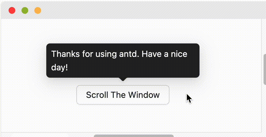
logoAnt Design

⌘ K
  • 디자인
  • 개발
  • 컴포넌트
  • 블로그
  • 자료
5.21.3
  • Components Overview
  • General
    • Button
    • FloatButton
      5.0.0
    • Icon
    • Typography
  • Layout
    • Divider
    • Flex
      5.10.0
    • Grid
    • Layout
    • Space
    • Splitter
      5.21.0
  • Navigation
    • Anchor
    • Breadcrumb
    • Dropdown
    • Menu
    • Pagination
    • Steps
  • Data Entry
    • AutoComplete
    • Cascader
    • Checkbox
    • ColorPicker
      5.5.0
    • DatePicker
    • Form
    • Input
    • InputNumber
    • Mentions
    • Radio
    • Rate
    • Select
    • Slider
    • Switch
    • TimePicker
    • Transfer
    • TreeSelect
    • Upload
  • Data Display
    • Avatar
    • Badge
    • Calendar
    • Card
    • Carousel
    • Collapse
    • Descriptions
    • Empty
    • Image
    • List
    • Popover
    • QRCode
      5.1.0
    • Segmented
    • Statistic
    • Table
    • Tabs
    • Tag
    • Timeline
    • Tooltip
    • Tour
      5.0.0
    • Tree
  • Feedback
    • Alert
    • Drawer
    • Message
    • Modal
    • Notification
    • Popconfirm
    • Progress
    • Result
    • Skeleton
    • Spin
    • Watermark
      5.1.0
  • Other
    • Affix
    • App
      5.1.0
    • ConfigProvider
    • Util
      5.13.0

Tooltip

간단한 텍스트 팝업 상자.
가져오기import{ Tooltip }from"antd";
소스components/tooltip
문서
이 페이지 수정변경 로그

Resources

Ant Design Charts
Ant Design Pro
Ant Design Pro Components
Ant Design Mobile
Ant Design Mini
Ant Design Landing-Landing Templates
Scaffolds-Scaffold Market
Umi-React Application Framework
dumi-Component doc generator
qiankun-Micro-Frontends Framework
ahooks-React Hooks Library
Ant Motion-Motion Solution
China Mirror 🇨🇳

Community

Awesome Ant Design
Medium
Twitter
yuque logoAnt Design in YuQue
Ant Design in Zhihu
Experience Cloud Blog
seeconf logoSEE Conf-Experience Tech Conference
Work with Us

Help

GitHub
Change Log
FAQ
Bug Report
Issues
Discussions
StackOverflow
SegmentFault

Ant XTech logoMore Products

yuque logoYuQue-Document Collaboration Platform
AntV logoAntV-Data Visualization
Egg logoEgg-Enterprise Node.js Framework
Kitchen logoKitchen-Sketch Toolkit
Galacean logoGalacean-Interactive Graphics Solution
xtech logoAnt Financial Experience Tech
Theme Editor
Made with ❤ by
Ant Group and Ant Design Community
loading

언제 사용하나요?

  • 마우스를 올리면 툴팁이 나타나고, 마우스를 떼면 툴팁이 사라집니다. 툴팁은 복잡한 텍스트나 작업을 지원하지 않습니다.
  • button/text/operation에 대한 설명을 제공하기 위해 사용됩니다. 종종 HTML의 title 속성 대신 사용됩니다.

예시

API

Common props ref:Common props

PropertyDescriptionTypeDefault
title툴팁에 표시되는 텍스트ReactNode | () => ReactNode-

공통 API

다음 API는 Tooltip, Popconfirm, Popover에서 공통으로 사용됩니다.

PropertyDescriptionTypeDefaultVersion
align이 값은 placement 설정에 병합됩니다. 설정은 dom-align을 참조하세요.object-
arrow화살표의 가시성을 변경하고, 화살표가 대상의 중앙을 가리킬지 여부boolean | { pointAtCenter: boolean }true5.2.0
autoAdjustOverflow팝업이 화면에서 벗어날 때 팝업 위치를 자동으로 조정할지 여부booleantrue
color배경 색상string-4.3.0
defaultOpen툴팁 카드가 기본적으로 열려 있는지 여부booleanfalse4.23.0
destroyTooltipOnHide툴팁이 숨겨질 때 삭제할지 여부booleanfalse
fresh툴팁이 닫히면 콘텐츠를 캐싱합니다. 이 속성을 설정하면 계속해서 업데이트됩니다.booleanfalse5.10.0
getPopupContainer팁이 표시될 DOM 컨테이너, 기본 동작은 body에 div 요소를 생성합니다.(triggerNode: HTMLElement) => HTMLElement() => document.body
mouseEnterDelay마우스를 올렸을 때 툴팁이 표시되기 전까지의 지연 시간 (초)number0.1
mouseLeaveDelay마우스를 뗐을 때 툴팁이 숨겨지기 전까지의 지연 시간 (초)number0.1
overlayClassName툴팁 카드의 클래스명string-
overlayStyle툴팁 카드의 스타일object-
overlayInnerStyle툴팁 내부 콘텐츠의 스타일object-
placement대상과의 상대적 위치, 선택 가능한 값: top left right bottom topLeft topRight bottomLeft bottomRight leftTop leftBottom rightTop rightBottomstringtop
trigger툴팁을 트리거하는 모드. 배열을 전달하여 여러 모드를 설정할 수 있음hover | focus | click | contextMenu | Array<string>hover
open툴팁 카드가 열려 있는지 여부. 4.23.0 이하에서는 visible 사용(이유 보기)booleanfalse4.23.0
zIndex툴팁의 z-index 설정number-
onOpenChange툴팁 카드의 가시성이 변경될 때 실행되는 콜백(open: boolean) => void-4.23.0

Design Token

컴포넌트 토큰어떻게 사용하나요?

토큰 이름설명타입기본값
zIndexPopup툴팁의 z-indexnumber1070

글로벌 토큰어떻게 사용하나요?

FAQ

왜 strict mode에서 findDOMNode is deprecated 경고가 종종 발생하나요?

이 문제는 rc-trigger의 구현 방식 때문입니다. rc-trigger는 자식 컴포넌트가 ref를 받아들이도록 강제하며, 그렇지 않으면 findDOMNode로 대체됩니다. 따라서 자식 컴포넌트는 네이티브 HTML 태그여야 하며, 그렇지 않다면 React.forwardRef를 사용합니다. React.forwardRef를 사용하면 ref가 네이티브 HTML 태그로 자동으로 넘겨줍니다.

  • findDOMNode is deprecated 재현: https://codesandbox.io/p/sandbox/finddomnode-c5hy96
  • forwardRef를 사용하여 문제 해결: https://codesandbox.io/p/sandbox/no-finddomnode-warning-forked-gdxczs

왜 가끔 HOC에서 작동하지 않나요?

Tooltip의 자식 노드가 onMouseEnter, onMouseLeave, onPointerEnter, onPointerLeave, onFocus, onClick 이벤트를 받아들이는지 확인해야 합니다.

placement 로직은 어떻게 되나요?

화면에 충분한 공간이 있으면 placement 설정을 따릅니다. 공간이 충분하지 않을 경우 top에서 bottom 또는 topLeft에서 bottomLeft 등으로 반전됩니다. top, bottom, left, right와 같은 단일 방향은 화면에 맞게 자동으로 이동됩니다:

shift

topLeft bottomRight와 같이 가장자리에 맞춰진 placement의 경우 반전만 수행되고 이동은 하지 않습니다.

왜 Tooltip이 닫힐 때 콘텐츠가 업데이트되지 않나요?

Tooltip은 닫힐 때 콘텐츠를 캐싱하여 콘텐츠가 업데이트될 때 깜빡임을 방지합니다:

// `title` will not blink when `user` is empty
<Tooltip open={user} title={user?.name} />
no blink

닫힐 때 콘텐츠를 업데이트해야 하는 경우, fresh 속성을 설정할 수 있습니다. (#44830):

<Tooltip open={user} title={user?.name} fresh />
no blink
Auto Shift
codepen icon
External Link Icon
expand codeexpand code
Basic
codepen icon
External Link Icon
expand codeexpand code
Arrow
codepen icon
External Link Icon
expand codeexpand code
Adjust placement automatically
codepen icon
External Link Icon
expand codeexpand code
Colorful Tooltip
codepen icon
External Link Icon
expand codeexpand code
Debug
codepen icon
External Link Icon
expand codeexpand code
Disabled children
codepen icon
External Link Icon
expand codeexpand code
Placement
codepen icon
External Link Icon
expand codeexpand code
Destroy tooltip when hidden
codepen icon
External Link Icon
expand codeexpand code
_InternalPanelDoNotUseOrYouWillBeFired
codepen icon
External Link Icon
expand codeexpand code
Disabled
codepen icon
External Link Icon
expand codeexpand code
Tooltip은 마우스를 올리면 표시됩니다.
With `getPopupContainer`
Without `getPopupContainer`
Presets
Custom
Tooltip은 숨겨지면 제거됩니다.
Hello, Pink Pure Panel!
Hello, Customize Color Pure Panel!
Hello, Pure Panel!
Tooltip은 마우스를 올리면 표시됩니다.