logoAnt Design

⌘ K
  • 디자인
  • 개발
  • 컴포넌트
  • 블로그
  • 자료
5.21.3
  • Ant Design
    • 소개
    • 设计价值观
    • Design Values
    • 实践案例
    • Cases
  • 全局样式
    • 色彩
    • 布局
    • 字体
    • 图标
    • 暗黑模式
    • 阴影
  • 전체 스타일
    • 색상
    • 레이아웃
    • 글꼴
    • 아이콘
  • Global Styles
    • Colors
    • Layout
    • Font
    • Icons
    • Dark Mode
    • Shadow
  • 设计模式
    • 概览
    • 全局规则
      • 反馈
      • 导航
      • 数据录入
      • 数据展示
      • 文案
      • 数据格式
      • 按钮
      • 数据列表
    • 原则
      • 亲密性
      • 对齐
      • 对比
      • 重复
      • 直截了当
      • 足不出户
      • 简化交互
      • 提供邀请
      • 巧用过渡
      • 即时反应
    • 模板文档
      • 数据可视化页
      • 详情页
  • Design Patterns
    • Overview
    • Global Rules
      • Feedback
      • Navigation
      • Data Entry
      • Data Display
      • Copywriting
      • Data format
      • Button
      • Data List
    • Principles
      • Proximity
      • Alignment
      • Contrast
      • Repetition
      • Make it Direct
      • Stay on the Page
      • Keep it Lightweight
      • Provide an Invitation
      • Use Transition
      • React Immediately
    • Template Document
      • Visualization Page
      • Detail Page
  • 设计模式 - 探索
    • 概览
    • 模板文档
      • 表单页
      • 工作台
      • 列表页
      • 结果页
      • 异常页
    • 全局规则
      • 导航
      • 消息与反馈
      • 空状态
  • Design Patterns (Research)
    • Overview
    • Template Document
      • Form Page
      • Workbench
      • List Page
      • Result Page
      • Exception Page
    • Global Rules
      • Navigation
      • Message and Feedback
      • Empty Status
  • 可视化
  • Visualization
  • 动效
  • Motion
  • 图形化
  • Illustrations

Icons

Resources

Ant Design Charts
Ant Design Pro
Ant Design Pro Components
Ant Design Mobile
Ant Design Mini
Ant Design Landing-Landing Templates
Scaffolds-Scaffold Market
Umi-React Application Framework
dumi-Component doc generator
qiankun-Micro-Frontends Framework
ahooks-React Hooks Library
Ant Motion-Motion Solution
China Mirror 🇨🇳

Community

Awesome Ant Design
Medium
Twitter
yuque logoAnt Design in YuQue
Ant Design in Zhihu
Experience Cloud Blog
seeconf logoSEE Conf-Experience Tech Conference
Work with Us

Help

GitHub
Change Log
FAQ
Bug Report
Issues
Discussions
StackOverflow
SegmentFault

Ant XTech logoMore Products

yuque logoYuQue-Document Collaboration Platform
AntV logoAntV-Data Visualization
Egg logoEgg-Enterprise Node.js Framework
Kitchen logoKitchen-Sketch Toolkit
Galacean logoGalacean-Interactive Graphics Solution
xtech logoAnt Financial Experience Tech
Theme Editor
Made with ❤ by
Ant Group and Ant Design Community
loading

An icon is a graphical representation of meaning. Icons can be used to express actions, state, and even to categorize data. Ant Design's icons adhere to the following two principles and are designed for cross-platform consistency:

  • Graphics that are clear, intuitive, and simple enjoy a higher degree of recognition and are more easily understood
  • All icons in the user interface should be consistent in style (detail design, perspective, stroke weight, etc.)

System Icons

System Icons
미리보기
System Icons

System icons are often used to represent commonly used operations, such as: save, edit, delete. Ant Design also includes icons to represent file types and state.

  • View the icons

Key Contour Lines

Ant Design's grid and key contour lines
미리보기
Ant Design's grid and key contour lines

Contour lines play an important role in making various icons with the same visual effect.

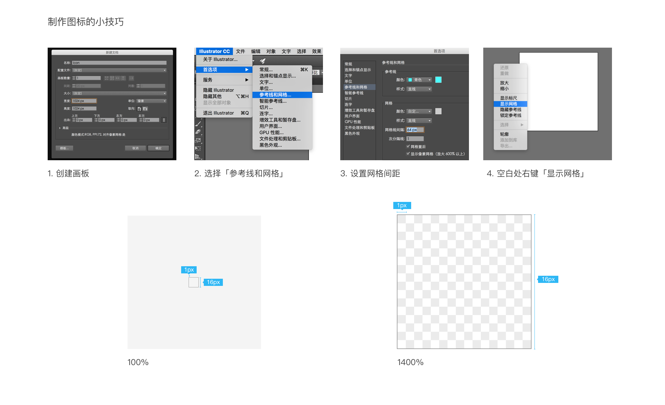
Please make all icons in the 1024×1024 resolution (16×16 64 times).

  • Illustrator tips
Square contour
미리보기
Square contour
Horizontal rectangle contour
미리보기
Horizontal rectangle contour
Circular contour
미리보기
Circular contour
Vertical rectangle contour
미리보기
Vertical rectangle contour

Stroke Weight

Correct example
미리보기
Correct example
Line thickness is consistently 72px
Incorrect example
미리보기
Incorrect example
Line thickness is not uniform

Consistent stroke weight is the key to maintaining the visual unity of the entire icon system. Ant Design's icons have a consistent line width of 72px.

Corners

Correct example
미리보기
Correct example
The icon's corners are properly rounded
Incorrect example
미리보기
Incorrect example
The icon's corners are not rounded

Consistent rounding of corners and sizing of angles is also an important element in maintaining visual unity.

Icons that follow Ant Design should have rounded corners and edges using a 72px radius.

Visual Correction

Correct example
미리보기
Correct example
For the intricate “JPG” lettering, an outline is added for readability
Incorrect example
미리보기
Incorrect example
The text in the icon is crowded and hard to read

In certain special cases (for example, when the icon is too compact), adjustments to line width, outlines, or other subtle changes may be made to increase readability.

Perspective

Correct example
미리보기
Correct example
Maintains a flat, simple style
Incorrect example
미리보기
Incorrect example
Icons should not have depth nor varying perspectives

Always keep a simple, flat style. Icons should not have a sense of depth nor a large amount of detail.

Naming Conventions

Naming Conventions
미리보기
Naming Conventions

Uniform naming conventions make finding icons faster and easier. For example, icons with a surrounding outline have a uniform "-o" suffix.

Icon Sizing

Icon Sizing
미리보기
Icon Sizing

Icons should be scaled according to the text size, according to the Ant Design specification.

For example, icons inline with 12pt font should be 12px in size with 8px of spacing.

Color

Color
미리보기
Color
Colors demonstrated - @Black = #000000, @White = #FFFFFF, @Blue-6 = #1890FF

The color of the icon should be consistent the color of the surrounding copy, unless the icon is being used to express state (in which case it should be colored accordingly).


Business Icons

Business Icons
미리보기
Business Icons

Business icons, unlike system icons, do not themselves have functional operations, but rather an abstraction that assists with copywriting. Compared to the system icon, the business icon is more rich in the details of the design, the size of the use of relatively large.

Note: Business icons design principles and system icons are basically the same, the details of the processing (such as stroke weight, fillet size, etc.) depending on the specific scene may be.

Icon Sizing

Icon Sizing
미리보기
Icon Sizing

In normal use, there are 32px (minimum size), 48px and 64px (maximum size) three options.

Color

Color
미리보기
Color

There are two kinds of business icon, single-color (neutral color) and double-color (neutral color + primary color), the area of primary color does not exceed 40% of the entire icon.