Tooltip align update
Tooltip align update
In the 5.3.0 version, we will update the underlying dependency @rc-component/trigger of the Tooltip component to better implement adaptive alignment logic. Before that, let's talk about some problems encountered in the previous version.
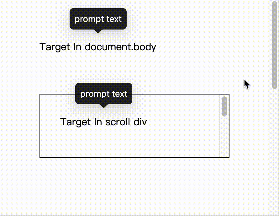
Tooltip is append to body by default, and it will scroll along with it when scrolling in full screen. But when the target element of the Tooltip is placed in the scrolling container, it will not follow the scrolling because the scrolling container is different:
We suggest to use getPopupContainer in FAQ, allowing developers to insert the popup element into the parent container of the target element through this method. But this solution is not perfect, because it requires the developer to determine which of the parent containers of the target element is the scrolling container. In a reused component, the component that uses the Tooltip may not be the same as the component it scrolls, which makes it not easy to set the target scroll container.
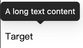
Tooltip supports edge display within the scrolling range. But because the pop-up layer is a whole, the centered arrow cannot point to the target position after offset:
We recommend using the placement property and configure topLeft to align the popup layer to the left to solve this problem before:
Similarly, if it is a reused component. Maybe it doesn't always need to be displayed side-by-side, it will be very strange when the popup layer is indeed left/right aligned when an element is displayed in the middle.
Tooltip uses the dom-align library for align, which will directly add left | top | transform styles to the dom node to achieve alignment, so in order to make it support the React life cycle, we encapsulated it on top of it rc-align component. In addition, it only cares about the alignment implementation, not the trigger timing itself. So the rc-align component will additionally add a ResizeObserver to monitor size changes, and then call dom-align for alignment.
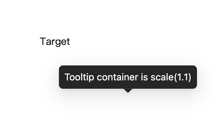
dom-align calculates the respective coordinate positions of the target element and the pop-up layer by traversing the parent layer nodes, and then calculates the difference according to the alignment rules. When the parent layer node has a transform style, it will cause the calculated coordinate position to be inaccurate, resulting in incorrect alignment:
The above problems such as scrolling and margining can be avoided in some ways, but the scaling problem cannot be solved. We hope that these problems can be solved by antd, rather than by the developers themselves. To this end, we rewrote the @rc-component/trigger component to integrate alignment logic and arrow logic. No longer depend on rc-align and dom-align. At the same time, use the new calculation method to avoid calculation problems caused by the transform style.
Considering that there are various positions in the parent node of the popup element, it is not cost-effective to recursively search the parent element node to calculate the relative position. We only need to calculate the offset according to the final positions of the two, and then apply the final zoom ratio of the popup layer:
left: 0 & top: 0 to force it to be aligned to the upper left corner
fixed, relative, and absolute nodes in position in the parent container of the Popup element, which does not affect our calculation of offset. Just make sure to make an offset at the 0/0 positiongetBoundingClientRect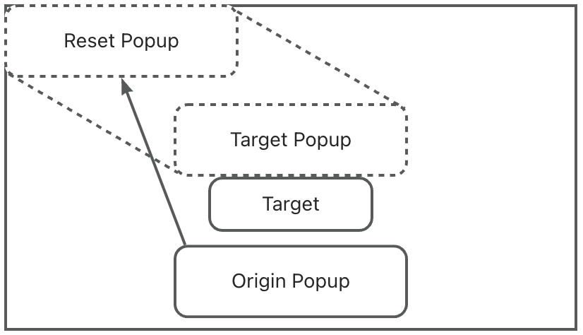
The zoom ratio cannot be obtained directly, but we can calculate the zoom ratio through getBoundingClientRect and offsetWidth/offsetHeight:
const popupRect = popupEle.getBoundingClientRect();const { offsetWidth, offsetHeight } = popupEle;const scaleX = popupRect.width / offsetWidth;const scaleY = popupRect.height / offsetHeight;
Then apply the scaling to the calculated offset:
// Some logic for align offset calculation// const baseOffsetX = ...// const baseOffsetY = ...const scaledOffsetX = baseOffsetX / scaleX;const scaledOffsetY = baseOffsetY / scaleY;
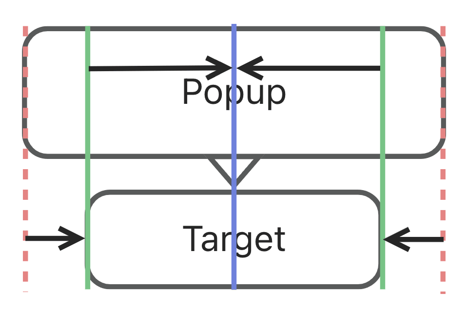
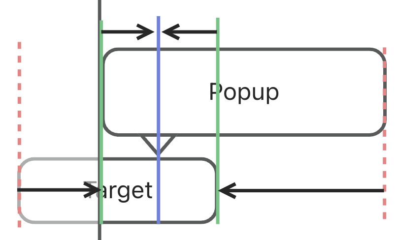
In the past, arrows were added by rc-tooltip instead of rc-trigger. This makes the rc-tooltip lost the alignment information, so that the arrow position cannot be adjusted correctly when the Popup is offset. To this end, we also integrate the arrow logic into rc-trigger, so that the position of the arrow can be offset with the offset of the Popup. After merging, the arrow position calculation becomes very simple. We only need to take the minimum value of the target element and the Popup boundary value, and then take the middle value:
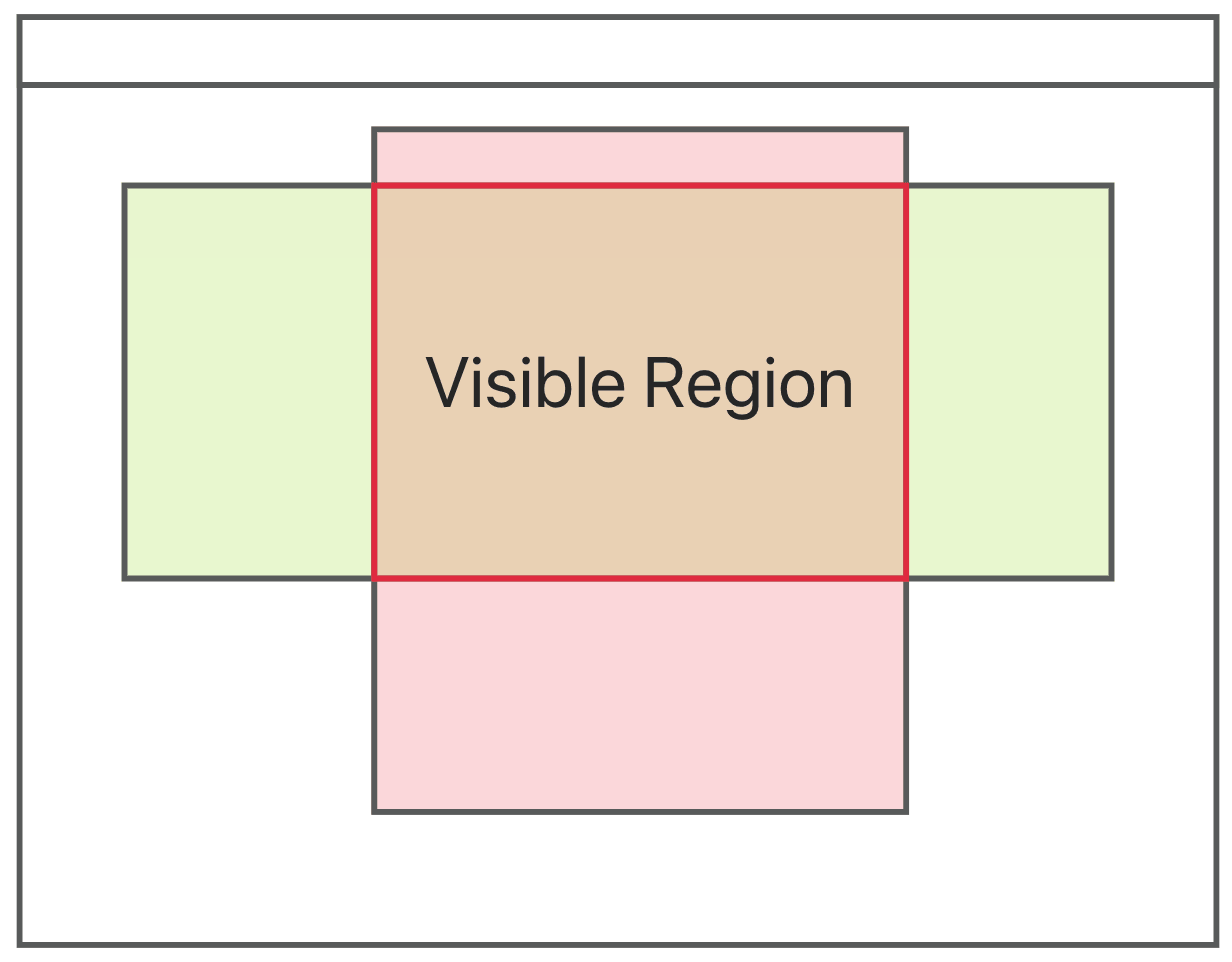
The new monitoring mode will detect the overflow style of the Popup parent node when the Tooltip is started. When scroll, hidden, and auto exist, the visible area except the scroll bar will be superimposed to calculate the final display area:
Similarly, we need to listen to its scrolling events. When any parent node is scrolled, the display area needs to be recalculated:
function collectScroll(ele: HTMLElement) {const scrollList: HTMLElement[] = [];let current = ele?.parentElement;while (current) {if (isScrollContainer(current)) {scrollList.push(ele);}current = current.parentElement;}return scrollList;}const targetScrollList = collectScroll(targetEle);const popupScrollList = collectScroll(popupEle);// We merge the list in real world. Here just for sample[window, ...targetScrollList, ...popupScrollList].forEach((ele) => {ele.addEventListener(...);});
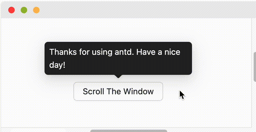
In the end, we get the effect of adaptive scrolling:
After completing the transformation of Tooltip, we will continue to transform other components which has popup element. We hope that after this, developers can use components directly instead of paying attention to the configuration of getPopupContainer as much as possible. Have a nice day!